Tarot Art & Practice
When Tarot Pips Become Scenes: Reading Across Decks
Open two tarot decks at the same numbered card and you may find two different invitations. One shows a rhythm of cups or swords across a patterned surface. Another places those objects around people, gestures and a landscape. The number and suit can agree while the experience of looking changes completely. That difference matters when a reader carries a remembered meaning from one deck into another.
A number is a structure; a scene adds a situation
A pip is a suit sign used to indicate a card’s value. Six cups can establish a rank without showing anyone drinking, giving or remembering. The Metropolitan Museum of Art’s account of tarot structure describes repeated suit symbols on numbered cards and identifies the Italian suits as cups, swords, batons and coins. This gives us a vocabulary for distinguishing a counted arrangement from a pictured episode.
Neither approach is visually empty. Spacing, symmetry, colour and ornament can reward attention even without human figures. A scene supplies additional information: someone acts, something occupies the foreground, a path leads somewhere. It also leaves things unspecified. A painted figure has no documented biography simply because we find its expression convincing.
For a modern reflective reader, these designs offer different starting points. A repeated arrangement may encourage attention to quantity, balance or a chosen number system. A scene may encourage attention to relationships and actions. These are possible approaches to reading, rather than evidence that either design can establish what will happen.
Give the illustrator credit
The Rider–Waite–Smith deck, first published in 1909, is an influential example of illustrated suit cards. The Victoria and Albert Museum’s illustrated history highlights Pamela Colman Smith’s role in creating its Minor Arcana imagery and the continuing influence of those designs. Including Smith in the deck’s name recognizes that pictures contribute meaning; they are not merely packaging for a text.
That observation has a practical consequence. If a remembered interpretation depends on a child, a wall or a boat in Smith’s composition, look for that feature in the deck you are actually holding. If it is absent, say that you are borrowing an association from another deck. A familiar keyword should not become an invisible illustration pasted over the current card.
Influence is also different from identity. A contemporary artist can retain a broad arrangement while changing the figures, setting or emotional tone. Readers can ask what that change makes more noticeable. The answer may be valuable without becoming a claim about the artist’s intentions, unless the artist has explained those intentions.
Check the edition before reading the date
The object in an online collection may be a later printing of a design. Wellcome Collection’s tarot-pack record describes a 1971 issue of 78 colour prints after Smith’s watercolours under Arthur Edward Waite’s direction. It lists four suits with an ace, numbered cards from two to ten, and four court ranks in each. The date identifies that publication, rather than the first appearance of the design.
This is useful when comparing photographs. A colour difference may belong to an edition, a reproduction or the photograph itself. Before building an interpretation around a precise shade, check the publisher and printing where possible. A screen image is a particular presentation of an object, with its own limits.
Avoid easy historical superlatives too. The British Museum’s Sola-Busca record documents a much earlier engraved tarot series, generally dated to 1491, and discusses uncertainty about attribution. Its survival reminds us that tarot design has a longer and less uniform history than a single modern deck. Appreciating Smith does not require declaring that every earlier numbered card was identical or unillustrated.
Try a comparison without forcing agreement
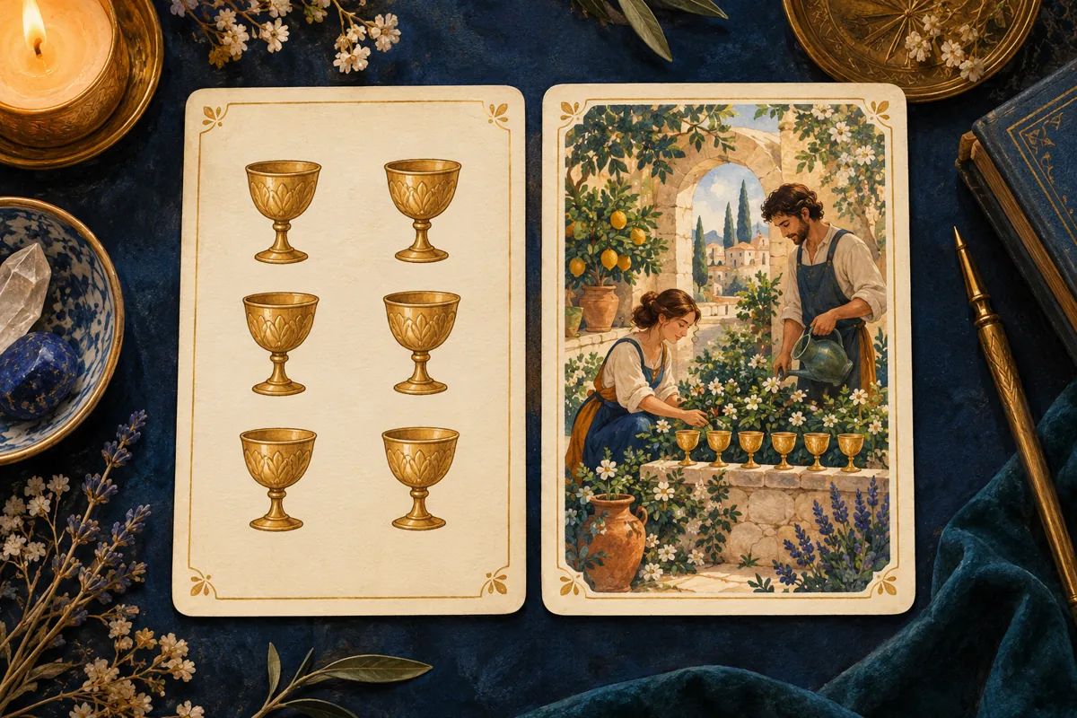
Imagine two deliberately invented Six of Cups designs. In the first, six cups form two columns of three. In the second, two adults tend a garden beside six cups on a wall. These are teaching examples, not descriptions of a historical deck or replacements for its guidebook. Our header illustration visualizes that invented comparison.
Start with the shared information: the suit and the count. Then name the differences. The first has repetition and bilateral arrangement. The second has people, cooperation, a cultivated space and an implied activity. Notice how quickly observation becomes a story: “two people are present” is visible; “they trust each other” is already an inference.
Now use a modest question: “How could I make a shared project easier to manage?” The arrangement could prompt a check on how tasks are divided. The garden scene could prompt a conversation about ongoing care. Neither interpretation proves that a partner is reliable. Both become useful when translated into questions that actual participants can answer.
Do not insist that the two readings produce the same sentence. Agreement obtained by ignoring the pictures defeats the comparison. Instead, keep the common framework and the different emphases together. You are studying how a visual prompt directs attention, not testing whether one picture has secretly decoded the other.
Separate three kinds of notes
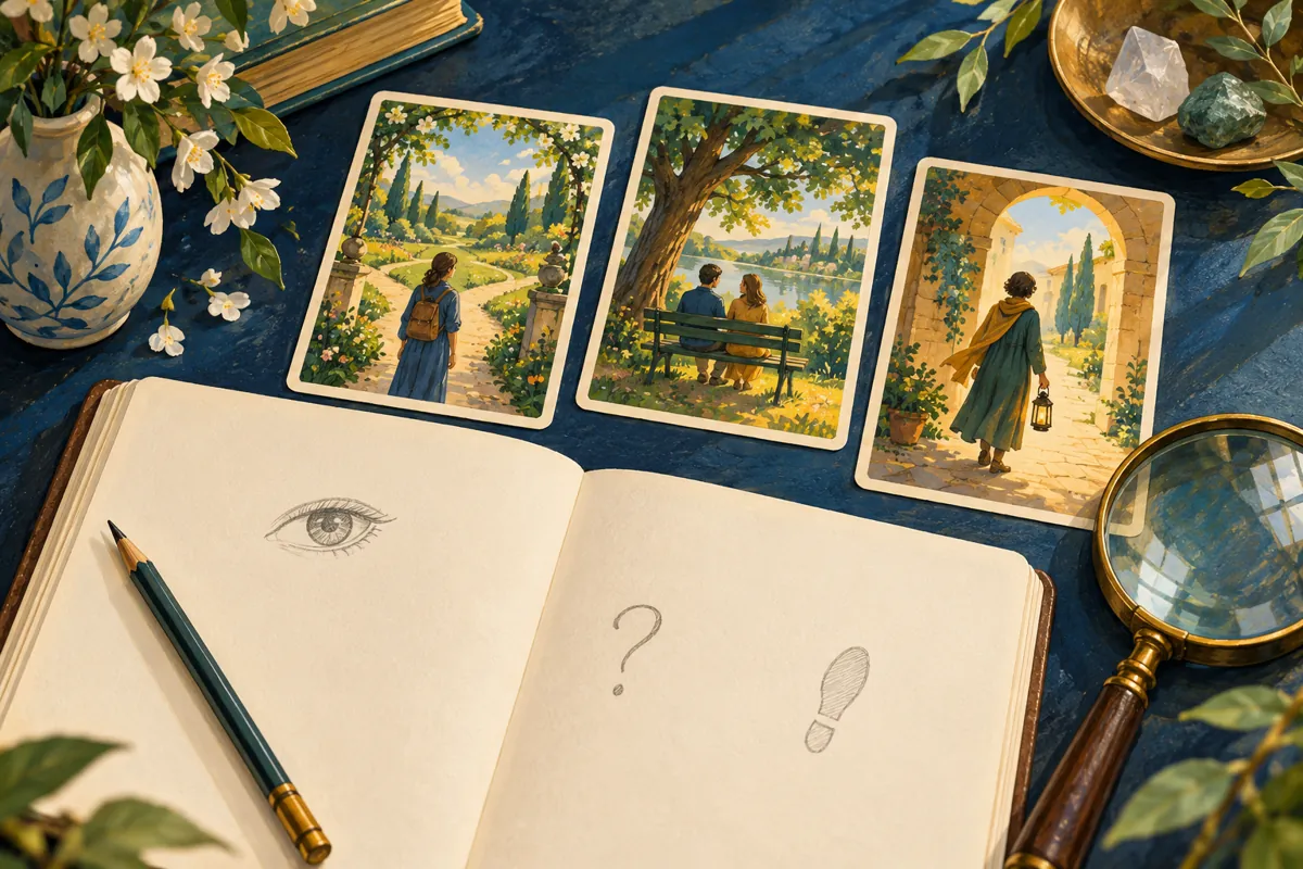
A simple journal can prevent interpretation from outrunning observation. First write what is visible, using nouns and verbs: a figure faces a doorway; three objects sit behind a chair; a hand points outward. Leave motives and emotional labels out of this first pass. If you cannot point to the detail, it probably belongs in a later note.
Next record the convention you are bringing. This might be a meaning from the deck’s booklet, a suit association from your chosen tradition, or a memory of another illustration. Give the convention a source. Our Minor Arcana guide provides a starting framework, but the specific deck and its accompanying text still deserve attention.
Finally write a provisional application to your question. Use language that leaves room for correction: “This prompts me to check whether responsibilities are clear.” Keep it distinct from an assertion such as “My colleague will abandon the work.” The first can lead to a useful conversation; the second invents knowledge about another person.
When the scene feels too persuasive
A vivid image can make one story feel immediate. Before accepting it, try naming a second plausible account of the same details. A solitary person might suggest independence, exclusion, concentration or a pause. The image alone does not settle which description fits your circumstances. Your question and information from life must do some of that work.
Resist adding extra cards merely to escape this uncertainty. First identify what information would help: an agreed deadline, an unanswered message, a conversation about expectations. Our question-writing guide can help turn a demand for certainty into a question about your own choices. A better question often does more than another draw.
Artwork remains worth examining even when it supplies no answer. You may discover that a remembered keyword had narrowed your attention, or that a different deck makes another aspect of the situation easier to discuss. Record that change as an effect of looking and reflecting, without presenting it as verification of predictive power.
Let the deck in front of you speak visually
Pip arrangements and illustrated scenes do not need to compete for legitimacy. Each makes some details available and leaves others open. Reading across decks becomes more careful when you distinguish the shared structure, the artist’s particular choices and the story you bring from elsewhere.
On your next comparison, choose one numbered card and spend a minute describing each version before consulting meanings. End with one question you can investigate outside the cards. That small discipline gives the artwork its due while keeping your judgment active. The reward is a more attentive encounter with a deck, rather than a promise that its pictures can decide your future.
Sources and further reading
Structure: The Met, Before Fortune-Telling. Design history: V&A, A history of tarot cards. Edition documentation: Wellcome Collection, tarot pack, 39276i. Earlier engraved cards: British Museum, Sola-Busca print record. The comparison, journal method and interpretive examples are original Precise Arcana editorial exercises. The illustrations are newly generated conceptual artwork, not museum photographs or reproductions of identified cards.